OctAdmin
Documentation1. Introduction
OctaAdmin is a popular Modern Looking open source WebApp template for admin dashboards
and control panels. OctaAdmin is fully responsive HTML template, which is based on
the CSS framework Bootstrap 4. It utilizes all of the Bootstrap components in its
design and re-styles many commonly used plugins to create a consistent design that
can be used as a user interface for backend applications. OctaAdmin is based on a
modular design, which allows it to be easily customized and built upon. This documentation
will guide you through installing the template and exploring the various components
that are bundled with the template.
We put a lot of love and effort to make OctaAdmin a useful template for everyone
and now It comes with 30+ Colors and with unique Modern Lokking Dashboards. We are
keen to release continuous long term updates and lots of new features will be coming
soon in the future releases. Once you purchased OctaAdmin, you will be entitled to
free download of all future updates for the same license.
Teamplate: octAdmin
Author: Octathemes
Contact: octathemes@gmail.com
website: https://octathemes.com
2. Features
- 30+ built-in Color Skins And You Can Your Own
- Light/Dark Sidebar Themes
- Premium Free Landing Pages For Your Website
- Multiple Layout
- Responsive layout
- Live Skin Customizer
- Loading progress bar
- Hundreds of UI Components
- Dozens of Widgets
- Hundreds of Utility Classes
- Font Icons(font-awesome, glyphicons, material design icons, etc..)
- HTML5 & CSS3
- Bootstrap 4 Framework
- Sass for CSS preprocessing (compiled CSS included)
- Gulp Tasks Manager
- Clean and Friendly Code
3. Installation
This is the simple static HTML template so no need any headech to install it.
Just simple steps to follow:
Teamplate (demo folder) +
asset Folders (css,fonts,img,js,libs)
= Template Ready.
Teamplate/
  |-- contents (All Html Pages)
  |-- css (All Css Files)
  |-- fonts (All Fonts Libs)
  |-- img (All Images)
  |-- js  (All Javascript Files)
  |-- libs (All Libraries)
5. Gulp Sass Starter Kit For Development
We use Include Gulp starter Kit with Browser sync , with Sass Compiler , so you can Edit /develop OctaAdmin Source Without any Trouble
To use Gulp you need some tools to be installed:
Start Commands:
You can use those commands to build dist and test your site:
-
npm installto install gulp and gulp dependencies -
npm startto start development server
6. Starter template
Be sure to have your pages set up with the latest design and development standards. That means:
- Using an HTML5 doctype
- Forcing Internet Explorer to use its latest rendering mode ( read more)
- And, utilizing the viewport meta tag.
Put it all together and your pages should look like this:
HTML5 Static Version
<!DOCTYPE html>
<html lang="en">

<head>

    <meta http-equiv="x-ua-compatible" content="ie=edge">
    <meta name="description" content="Admin, Dashboard, Bootstrap" />
    <meta name="viewport" content="width=device-width, initial-scale=1.0" />
    <title>octAdmin - powerfull minimal ultimate all in one bootstrap admin Teamplate</title>
    <link rel="icon" type="image/png" sizes="16x16" href="../../img/favicon/favicon-16x16.png">

    <!-- fonts -->
    <link rel="stylesheet" href="../../fonts/md-fonts/css/materialdesignicons.min.css">
    <link rel="stylesheet" href="../../fonts/font-awesome-4.7.0/css/font-awesome.min.css">
    <!-- animate css -->
    <link rel="stylesheet" href="../../libs/animate.css/animate.min.css">

    <!-- octadmin main style -->
    <link id="pageStyle" rel="stylesheet" href="../../css/style.css">

     <!-- HTML5 Shim and Respond.js IE8 support of HTML5 elements and media queries -->
    <!-- WARNING: Respond.js doesn't work if you view the page via file:// -->
    <!--[if lt IE 9]>
    <script src="https://oss.maxcdn.com/libs/html5shiv/3.7.0/html5shiv.js"></script>
    <script src="https://oss.maxcdn.com/libs/respond.js/1.4.2/respond.min.js"></script>
<![endif]-->

</head>

<body class="app sidebar-fixed aside-menu-off-canvas aside-menu-hidden header-fixed footer-fixed">
    <header class="app-header navbar">
        <div class="hamburger hamburger--arrowalt-r navbar-toggler mobile-sidebar-toggler d-lg-none mr-auto">
            <div class="hamburger-box">
                <div class="hamburger-inner"></div>
            </div>
        </div>
        <!-- end hamburger -->
        <a class="navbar-brand" href="#"> <strong>octAdmin</strong></a>

        <div class="hamburger hamburger--arrowalt-r navbar-toggler sidebar-toggler d-md-down-none mr-auto">
            <div class="hamburger-box">
                <div class="hamburger-inner"></div>
            </div>
        </div>
        <!-- end hamburger -->

        <div class="navbar-search">
            <button type="submit" class="navbar-search-btn">
                <i class="mdi mdi-magnify"></i>
            </button>
            <input type="text" class="navbar-search-input" placeholder="Find User a user, team, meeting ..">
        </div>
        <!-- end navbar-search -->
        <div class="hamburger hamburger--arrowalt-r navbar-toggler aside-menu-toggler ">
            <div class="hamburger-box">
                <div class="hamburger-inner"></div>
            </div>
        </div>
    </header>
    <!-- end header -->

    <div class="app-body">
        <div class="sidebar" id="sidebar">
            <nav class="sidebar-nav" id="sidebar-nav-scroller">
                <ul class="nav">
                    <li class="nav-item nav-dropdown">
                        <a class="nav-link nav-dropdown-toggle" href="../../index.html">
                            <i class="mdi mdi-gauge"></i> Dashboard</a>
                    </li>

                </ul>
            </nav>

        </div>
        <!-- end sidebar -->

        <main class="main">
            <!-- Breadcrumb -->
            <ol class="breadcrumb bc-colored bg-theme" id="breadcrumb">
                <li class="breadcrumb-item ">
                    <a href="">Home</a>
                </li>
                <li class="breadcrumb-item">
                    <a href="#">UI Components</a>
                </li>
                <li class="breadcrumb-item active">Alerts</li>
            </ol>

            <div class="container-fluid">

                <div class="animated fadeIn">
                    <h3>Heading </h3>
                    <small>
                        <a href="#">Official Website</a>
                    </small>
                    <div class="row">
                        <div class="col-md-12">
                            <div class="card card-accent-theme">
                                <div class="card-body">

                                </div>
                                <!-- end card-body -->
                            </div>
                            <!-- end card -->
                        </div>
                        <!-- end col -->
                    </div>
                    <!-- end row -->

                </div>
                <!-- end animated fadeIn -->
            </div>
            <!-- end container-fluid -->

        </main>
        <!-- end main -->

        <aside class="aside-menu">
                <div class="aside-header bg-theme text-uppercase">Service Panel</div>
                <div class="aside-body">
                      <h6 class="text-theme">Aside Menu</h6>
                </div>
         </aside>
            <!-- end aside -->

    </div>
    <!-- end app-body -->


    <footer class="app-footer">
        <a href="#" class="text-theme">octAdmin</a> © 2018 octaThemes.
        <span class="float-right">Powered by
            <a href="#" class="text-theme">octAdmin</a>
        </span>
    </footer>


    <!-- Bootstrap and necessary plugins -->
    <script src="../../libs/jquery/dist/jquery.min.js"></script>
    <script src="../../libs/popper.js/dist/umd/popper.min.js"></script>
    <script src="../../libs/bootstrap/bootstrap.min.js"></script>
    <script src="../../libs/PACE/pace.min.js"></script>
    <script src="../../libs/chart.js/dist/Chart.min.js"></script>
    <script src="../../libs/nicescroll/jquery.nicescroll.min.js"></script>


    <!-- octadmin Main Script -->
    <script src="../../js/app.js"></script>

</body>

</html>
7. Layouts
Containers
Containers are the most basic layout element in Bootstrap and are required when using our default grid system. Choose from a responsive, fixed-width container (meaning its max-width changes at each breakpoint) or fluid-width (meaning it’s 100% wide all the time).
While containers can be nested, most layouts do not require a nested container.
<div class="container">
    <!-- Content here -->
</div>
Use .container-fluid for a full width container, spanning the entire width of the viewport.
<div class="container-fluid">
    ...
</div>
Responsive breakpoints
Since Bootstrap is developed to be mobile first, we use a handful of media queries to create sensible breakpoints for our layouts and interfaces. These breakpoints are mostly based on minimum viewport widths and allow us to scale up elements as the viewport changes.
Bootstrap primarily uses the following media query ranges—or breakpoints—in our source Sass files for our layout, grid system, and components.
// Extra small devices (portrait phones, less than 576px)
// No media query since this is the default in Bootstrap

// Small devices (landscape phones, 576px and up)
@media (min-width: 576px) { ... }

// Medium devices (tablets, 768px and up)
@media (min-width: 768px) { ... }

// Large devices (desktops, 992px and up)
@media (min-width: 992px) { ... }

// Extra large devices (large desktops, 1200px and up)
@media (min-width: 1200px) { ... }
Since we write our source CSS in Sass, all our media queries are available via Sass mixins:
@include media-breakpoint-up(xs) { ... }
@include media-breakpoint-up(sm) { ... }
@include media-breakpoint-up(md) { ... }
@include media-breakpoint-up(lg) { ... }
@include media-breakpoint-up(xl) { ... }

// Example usage:
@include media-breakpoint-up(sm) {
  .some-class {
    display: block;
  }
}
We occasionally use media queries that go in the other direction (the given screen size or smaller):
// Extra small devices (portrait phones, less than 576px)
@media (max-width: 575px) { ... }

// Small devices (landscape phones, less than 768px)
@media (max-width: 767px) { ... }

// Medium devices (tablets, less than 992px)
@media (max-width: 991px) { ... }

// Large devices (desktops, less than 1200px)
@media (max-width: 1199px) { ... }

// Extra large devices (large desktops)
// No media query since the extra-large breakpoint has no upper bound on its width
Once again, these media queries are also available via Sass mixins:
@include media-breakpoint-down(xs) { ... }
@include media-breakpoint-down(sm) { ... }
@include media-breakpoint-down(md) { ... }
@include media-breakpoint-down(lg) { ... }
There are also media queries and mixins for targeting a single segment of screen sizes using the minimum and maximum breakpoint widths.
// Extra small devices (portrait phones, less than 576px)
@media (max-width: 575px) { ... }

// Small devices (landscape phones, 576px and up)
@media (min-width: 576px) and (max-width: 767px) { ... }

// Medium devices (tablets, 768px and up)
@media (min-width: 768px) and (max-width: 991px) { ... }

// Large devices (desktops, 992px and up)
@media (min-width: 992px) and (max-width: 1199px) { ... }

// Extra large devices (large desktops, 1200px and up)
@media (min-width: 1200px) { ... }
These media queries are also available via Sass mixins:
@include media-breakpoint-only(xs) { ... }
@include media-breakpoint-only(sm) { ... }
@include media-breakpoint-only(md) { ... }
@include media-breakpoint-only(lg) { ... }
@include media-breakpoint-only(xl) { ... }
Similarly, media queries may span multiple breakpoint widths:
// Example
// Apply styles starting from medium devices and up to extra large devices
@media (min-width: 768px) and (max-width: 1199px) { ... }
The Sass mixin for targeting the same screen size range would be:
@include media-breakpoint-between(md, xl) { ... }Z-index
Several Bootstrap components utilize z-index, the CSS property that helps control layout by providing a third axis to arrange content. We utilize a default z-index scale in Bootstrap that’s been designed to properly layer navigation, tooltips and popovers, modals, and more.
We don’t encourage customization of these values; should you change one, you likely need to change them all.
$zindex-dropdown:          1000 !default;
$zindex-fixed:             1030 !default;
$zindex-sticky:            1030 !default;
$zindex-modal-backdrop:    1040 !default;
$zindex-modal:             1050 !default;
$zindex-popover:           1060 !default;
$zindex-tooltip:           1070 !default;
Background elements—like the backdrops that allow click-dismissing—tend to reside on a lower z-indexs, while navigation and popovers utilize higher z-indexs to ensure they overlay surrounding content.
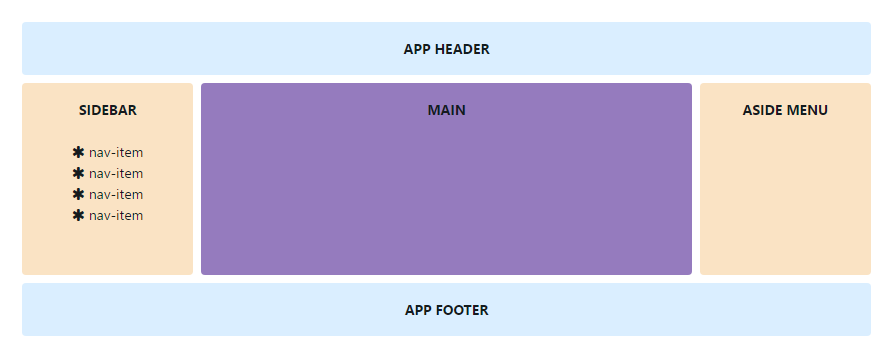
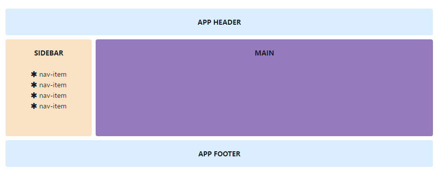
OctaAdmin template includes several layout options.
** Standard layout
Standard layout comes with following components: Header, Footer, Sidebar, Main & Aside Menu.
<body class="app">
  <header class="app-header navbar">
    <!-- Header content here -->
  </header>
  <div class="app-body">
    <div class="sidebar">
      <!-- Sidebar content here -->
    </div>
    <main class="main">
      <!-- Main content here -->
    </main>
    <aside class="aside-menu">
      <!-- Aside menu content here -->
    </aside>
  </div>
  <footer class="app-footer">
    <!-- Footer content here -->
  </footer>
</body>
Header options
Fixed position
Position the header element at the top of the viewport, from edge to edge. You have to add .header-fixed to body tag.
<body class="app header-fixed">
  <!-- Body content here -->
</body>
Sidebar options
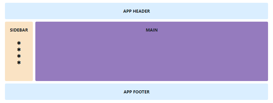
Our template comes with some sidebar options which you can activate in your application
Minimized sidebar
Minimized sidebar has 80px width and only icons are visible. You can change minimized sidebar width in SCSS Files (_variables.scss, $sidebar-minimized-width).
<body class="app sidebar-compact">
<!-- Body content here -->
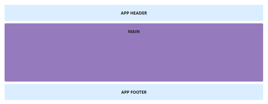
</body>Hidden sidebar
If you want to hide sidebar you have to add .sidebar-hidden class to body element
<body class="app sidebar-hidden">
    <!-- Body content here -->
  </body>
Fixed position
Position the sidebar element at the left of the viewport, from edge to edge. You have to add .sidebar-fixed to body tag.
<body class="app sidebar-fixed">
    <!-- Body content here -->
  </body>
Aside menu options
OctaAdmin template comes with some aside menu options which you can activate in your application
Hidden aside menu
If you want to hide aside menu you have to add .aside-menu-hidden class to body element
<body class="app aside-menu-hidden">
    <!-- Body content here -->
  </body>
Fixed position
Position the aside menu element at the right of the viewport, from edge to edge. You have to add .aside-menu-fixed to body tag.
<body class="app aside-menu-fixed">
    <!-- Body content here -->
  </body>
Footer options
Fixed position
Position the footer element at the top of the viewport, from edge to edge. You have to add .footer-fixed to body tag.
<body class="app footer-fixed">
    <!-- Body content here -->
  </body>
8. Grid System
How it works
Bootstrap’s grid system uses a series of containers, rows, and columns to layout and align content. It’s built with flexbox and is fully responsive. Below is an example and an in-depth look at how the grid comes together.
The above example creates three equal-width columns on small, medium, large, and extra large devices using our predefined grid classes. Those columns are centered in the page with the parent .container.
Breaking it down, here’s how it works:
- Containers provide a means to center your site’s contents. Use
.containerfor fixed width or.container-fluidfor full width. - Rows are horizontal groups of columns that ensure your columns are lined up properly. We use the negative margin method on
.rowto ensure all your content is aligned properly down the left side. - Content should be placed within columns, and only columns may be immediate children of rows.
- Thanks to flexbox, grid columns without a set width will automatically layout with equal widths. For example, four instances of
.col-smwill each automatically be 25% wide for small breakpoints. - Column classes indicate the number of columns you’d like to use out of the possible 12 per row. So, if you want three equal-width columns, you can use
.col-sm-4. - Column
widths are set in percentages, so they’re always fluid and sized relative to their parent element. - Columns have horizontal
paddingto create the gutters between individual columns, however, you can remove themarginfrom rows andpaddingfrom columns with.no-gutterson the.row. - There are five grid tiers, one for each responsive breakpoint: all breakpoints (extra small), small, medium, large, and extra large.
- Grid tiers are based on minimum widths, meaning they apply to that one tier and all those above it (e.g.,
.col-sm-4applies to small, medium, large, and extra large devices). - You can use predefined grid classes or Sass mixins for more semantic markup.
Be aware of the limitations and bugs around flexbox, like the inability to use some HTML elements as flex containers.
Sounds good? Great, let’s move on to seeing all that in an example.
Grid options
While Bootstrap uses ems or rems for defining most sizes, pxs are used for grid breakpoints and container widths. This is because the viewport width is in pixels and does not change with the font size.
See how aspects of the Bootstrap grid system work across multiple devices with a handy table.
|
Extra small <576px |
Small ≥576px |
Medium ≥768px |
Large ≥992px |
Extra large ≥1200px |
|
|---|---|---|---|---|---|
| Max container width | None (auto) | 540px | 720px | 960px | 1140px |
| Class prefix | .col- |
.col-sm- |
.col-md- |
.col-lg- |
.col-xl- |
| # of columns | 12 | ||||
| Gutter width | 30px (15px on each side of a column) | ||||
| Nestable | Yes | ||||
| Column ordering | Yes | ||||
Auto-layout columns
Utilize breakpoint-specific column classes for easy column sizing without an explicit numbered class like .col-sm-6.
Equal-width
For example, here are two grid layouts that apply to every device and viewport, from xs to xl. Add any number of unit-less classes for each breakpoint you need and every column will be the same width.
<div class="container">
  <div class="row">
    <div class="col">
      1 of 2
    </div>
    <div class="col">
      2 of 2
    </div>
  </div>
  <div class="row">
    <div class="col">
      1 of 3
    </div>
    <div class="col">
      2 of 3
    </div>
    <div class="col">
      3 of 3
    </div>
  </div>
</div>
Equal-width columns can be broken into multiple lines, but there is a Safari flexbox bug that prevents this from working without an explicit flex-basis or border. Our example works thanks to the border being set; you can do the same with .col { border: 1px solid transparent; }. Alternatively, you can set the flex-basis to the width of the column (e.g., .col { flex: 1 0 50%; }).
Both these fixes have been documented in a reduced test case outside Bootstrap.
<div class="container">
  <div class="row">
    <div class="col">Column</div>
    <div class="col">Column</div>
    <div class="w-100"></div>
    <div class="col">Column</div>
    <div class="col">Column</div>
  </div>
</div>
Setting one column width
Auto-layout for flexbox grid columns also means you can set the width of one column and have the sibling columns automatically resize around it. You may use predefined grid classes (as shown below), grid mixins, or inline widths. Note that the other columns will resize no matter the width of the center column.
<div class="container">
  <div class="row">
    <div class="col">
      1 of 3
    </div>
    <div class="col-6">
      2 of 3 (wider)
    </div>
    <div class="col">
      3 of 3
    </div>
  </div>
  <div class="row">
    <div class="col">
      1 of 3
    </div>
    <div class="col-5">
      2 of 3 (wider)
    </div>
    <div class="col">
      3 of 3
    </div>
  </div>
</div>
Variable width content
Use col-{breakpoint}-auto classes to size columns based on the natural width of their content.
<div class="container">
  <div class="row justify-content-md-center">
    <div class="col col-lg-2">
      1 of 3
    </div>
    <div class="col-md-auto">
      Variable width content
    </div>
    <div class="col col-lg-2">
      3 of 3
    </div>
  </div>
  <div class="row">
    <div class="col">
      1 of 3
    </div>
    <div class="col-md-auto">
      Variable width content
    </div>
    <div class="col col-lg-2">
      3 of 3
    </div>
  </div>
</div>
Equal-width multi-row
Create equal-width columns that span multiple rows by inserting a .w-100 where you want the columns to break to a new line. Make the breaks responsive by mixing the .w-100 with some responsive display utilities.
<div class="row">
  <div class="col">col</div>
  <div class="col">col</div>
  <div class="w-100"></div>
  <div class="col">col</div>
  <div class="col">col</div>
</div>
Responsive classes
Bootstrap’s grid includes five tiers of predefined classes for building complex responsive layouts. Customize the size of your columns on extra small, small, medium, large, or extra large devices however you see fit.
All breakpoints
For grids that are the same from the smallest of devices to the largest, use the .col and .col-* classes. Specify a numbered class when you need a particularly sized column; otherwise, feel free to stick to .col.
<div class="row">
  <div class="col">col</div>
  <div class="col">col</div>
  <div class="col">col</div>
  <div class="col">col</div>
</div>
<div class="row">
  <div class="col-8">col-8</div>
  <div class="col-4">col-4</div>
</div>
Stacked to horizontal
Using a single set of .col-sm-* classes, you can create a basic grid system that starts out stacked on extra small devices before becoming horizontal on desktop (medium) devices.
<div class="row">
  <div class="col-sm-8">col-sm-8</div>
  <div class="col-sm-4">col-sm-4</div>
</div>
<div class="row">
  <div class="col-sm">col-sm</div>
  <div class="col-sm">col-sm</div>
  <div class="col-sm">col-sm</div>
</div>
Mix and match
Don’t want your columns to simply stack in some grid tiers? Use a combination of different classes for each tier as needed. See the example below for a better idea of how it all works.
<!-- Stack the columns on mobile by making one full-width and the other half-width -->
<div class="row">
  <div class="col-12 col-md-8">.col-12 .col-md-8</div>
  <div class="col-6 col-md-4">.col-6 .col-md-4</div>
</div>

<!-- Columns start at 50% wide on mobile and bump up to 33.3% wide on desktop -->
<div class="row">
  <div class="col-6 col-md-4">.col-6 .col-md-4</div>
  <div class="col-6 col-md-4">.col-6 .col-md-4</div>
  <div class="col-6 col-md-4">.col-6 .col-md-4</div>
</div>

<!-- Columns are always 50% wide, on mobile and desktop -->
<div class="row">
  <div class="col-6">.col-6</div>
  <div class="col-6">.col-6</div>
</div>
Alignment
Use flexbox alignment utilities to vertically and horizontally align columns.
Vertical alignment
<div class="container">
  <div class="row align-items-start">
    <div class="col">
      One of three columns
    </div>
    <div class="col">
      One of three columns
    </div>
    <div class="col">
      One of three columns
    </div>
  </div>
  <div class="row align-items-center">
    <div class="col">
      One of three columns
    </div>
    <div class="col">
      One of three columns
    </div>
    <div class="col">
      One of three columns
    </div>
  </div>
  <div class="row align-items-end">
    <div class="col">
      One of three columns
    </div>
    <div class="col">
      One of three columns
    </div>
    <div class="col">
      One of three columns
    </div>
  </div>
</div><div class="container">
<div class="row">
<div class="col align-self-start">
One of three columns
</div>
<div class="col align-self-center">
One of three columns
</div>
<div class="col align-self-end">
One of three columns
</div>
</div>
</div>Horizontal alignment
<div class="container">
  <div class="row justify-content-start">
    <div class="col-4">
      One of two columns
    </div>
    <div class="col-4">
      One of two columns
    </div>
  </div>
  <div class="row justify-content-center">
    <div class="col-4">
      One of two columns
    </div>
    <div class="col-4">
      One of two columns
    </div>
  </div>
  <div class="row justify-content-end">
    <div class="col-4">
      One of two columns
    </div>
    <div class="col-4">
      One of two columns
    </div>
  </div>
  <div class="row justify-content-around">
    <div class="col-4">
      One of two columns
    </div>
    <div class="col-4">
      One of two columns
    </div>
  </div>
  <div class="row justify-content-between">
    <div class="col-4">
      One of two columns
    </div>
    <div class="col-4">
      One of two columns
    </div>
  </div>
</div>
No gutters
The gutters between columns in our predefined grid classes can be removed with .no-gutters. This removes the negative margins from .row and the horizontal padding from all immediate children columns.
Here’s the source code for creating these styles. Note that column overrides are scoped to only the first children columns and are targeted via attribute selector. While this generates a more specific selector, column padding can still be further customized with spacing utilities.
Need an edge-to-edge design? Drop the parent .container or .container-fluid.
.no-gutters {
  margin-right: 0;
  margin-left: 0;

  > .col,
  > [class*="col-"] {
    padding-right: 0;
    padding-left: 0;
  }
}
In practice, here’s how it looks. Note you can continue to use this with all other predefined grid classes (including column widths, responsive tiers, reorders, and more).
<div class="row no-gutters">
  <div class="col-12 col-sm-6 col-md-8">.col-12 .col-sm-6 .col-md-8</div>
  <div class="col-6 col-md-4">.col-6 .col-md-4</div>
</div>
Column wrapping
If more than 12 columns are placed within a single row, each group of extra columns will, as one unit, wrap onto a new line.
Since 9 + 4 = 13 > 12, this 4-column-wide div gets wrapped onto a new line as one contiguous unit.
Subsequent columns continue along the new line.
<div class="row">
<div class="col-9">.col-9</div>
<div class="col-4">.col-4<br>Since 9 + 4 = 13 > 12, this 4-column-wide div gets wrapped onto a new line as one contiguous unit.</div>
<div class="col-6">.col-6<br>Subsequent columns continue along the new line.</div>
</div>Column resets
With the handful of grid tiers available, you’re bound to run into issues where, at certain breakpoints, your columns don’t clear quite right as one is taller than the other. To fix that, use a combination of a .clearfix and our responsive display utilities.
<div class="row">
  <div class="col-6 col-sm-3">.col-6 .col-sm-3</div>
  <div class="col-6 col-sm-3">.col-6 .col-sm-3</div>

  <!-- Add the extra clearfix for only the required viewport -->
  <div class="clearfix d-none d-sm-block"></div>

  <div class="col-6 col-sm-3">.col-6 .col-sm-3</div>
  <div class="col-6 col-sm-3">.col-6 .col-sm-3</div>
</div>
Reordering
Flex order
Use .order- classes for controlling the visual order of your content. These classes are responsive, so you can set the order by breakpoint (e.g., .order-1.order-md-2). Includes support for 1 through 12 across all five grid tiers.
<div class="container">
  <div class="row">
    <div class="col">
      First, but unordered
    </div>
    <div class="col order-12">
      Second, but last
    </div>
    <div class="col order-1">
      Third, but first
    </div>
  </div>
</div>
Offsetting columns
With the move to flexbox in v4, we no longer have v3’s style of offset classes. Instead, use margin utilities like .mr-auto to force sibling columns away from one another.
<div class="row">
  <div class="col-md-4">.col-md-4</div>
  <div class="col-md-4 ml-auto">.col-md-4 .ml-auto</div>
</div>
<div class="row">
  <div class="col-md-3 ml-md-auto">.col-md-3 .ml-md-auto</div>
  <div class="col-md-3 ml-md-auto">.col-md-3 .ml-md-auto</div>
</div>
<div class="row">
  <div class="col-auto mr-auto">.col-auto .mr-auto</div>
  <div class="col-auto">.col-auto</div>
</div>
Nesting
To nest your content with the default grid, add a new .row and set of .col-sm-* columns within an existing .col-sm-* column. Nested rows should include a set of columns that add up to 12 or fewer (it is not required that you use all 12 available columns).
<div class="row">
  <div class="col-sm-9">
    Level 1: .col-sm-9
    <div class="row">
      <div class="col-8 col-sm-6">
        Level 2: .col-8 .col-sm-6
      </div>
      <div class="col-4 col-sm-6">
        Level 2: .col-4 .col-sm-6
      </div>
    </div>
  </div>
</div>
Sass mixins
When using Bootstrap’s source Sass files, you have the option of using Sass variables and mixins to create custom, semantic, and responsive page layouts. Our predefined grid classes use these same variables and mixins to provide a whole suite of ready-to-use classes for fast responsive layouts.
Variables
Variables and maps determine the number of columns, the gutter width, and the media query point at which to begin floating columns. We use these to generate the predefined grid classes documented above, as well as for the custom mixins listed below.
$grid-columns:      12;
$grid-gutter-width: 30px;

$grid-breakpoints: (
  // Extra small screen / phone
  xs: 0,
  // Small screen / phone
  sm: 576px,
  // Medium screen / tablet
  md: 768px,
  // Large screen / desktop
  lg: 992px,
  // Extra large screen / wide desktop
  xl: 1200px
);

$container-max-widths: (
  sm: 540px,
  md: 720px,
  lg: 960px,
  xl: 1140px
);
Mixins
Mixins are used in conjunction with the grid variables to generate semantic CSS for individual grid columns.
// Creates a wrapper for a series of columns
@include make-row();

// Make the element grid-ready (applying everything but the width)
@include make-col-ready();
@include make-col($size, $columns: $grid-columns);
Example usage
You can modify the variables to your own custom values, or just use the mixins with their default values. Here’s an example of using the default settings to create a two-column layout with a gap between.
.example-container {
  width: 800px;
  @include make-container();
}

.example-row {
  @include make-row();
}

.example-content-main {
  @include make-col-ready();

  @include media-breakpoint-up(sm) {
    @include make-col(6);
  }
  @include media-breakpoint-up(lg) {
    @include make-col(8);
  }
}

.example-content-secondary {
  @include make-col-ready();

  @include media-breakpoint-up(sm) {
    @include make-col(6);
  }
  @include media-breakpoint-up(lg) {
    @include make-col(4);
  }
}<div class="example-container">
<div class="example-row">
<div class="example-content-main">Main content</div>
<div class="example-content-secondary">Secondary content</div>
</div>
</div>Customizing the grid
Using our built-in grid Sass variables and maps, it’s possible to completely customize the predefined grid classes. Change the number of tiers, the media query dimensions, and the container widths—then recompile.
Columns and gutters
The number of grid columns can be modified via Sass variables. $grid-columns is used to generate the widths (in percent) of each individual column while $grid-gutter-width allows breakpoint-specific widths that are divided evenly across padding-left and padding-right for the column gutters.
$grid-columns: 12 !default;
$grid-gutter-width: 30px !default;
Grid tiers
Moving beyond the columns themselves, you may also customize the number of grid tiers. If you wanted just four grid tiers, you’d update the $grid-breakpoints and $container-max-widths to something like this:
$grid-breakpoints: (
  xs: 0,
  sm: 480px,
  md: 768px,
  lg: 1024px
);

$container-max-widths: (
  sm: 420px,
  md: 720px,
  lg: 960px
);
When making any changes to the Sass variables or maps, you’ll need to save your changes and recompile. Doing so will out a brand new set of predefined grid classes for column widths and ordering. Responsive visibility utilities will also be updated to use the custom breakpoints.
9. Scss & Css
OctAdmin Template is based on scss and we import all the file into style.css you can simply edit any scss and compile it
Scss Folder Structure
    scss/
    |-- 0-plugins (all Plugins scss Files)
    |-- 1-base (all base style scss files)
    |-- 2-components (all Components style scss files)
    |-- 3-layouts (all Layouts style scss files)
    |-- 4-pages (some pages style scss files)
    |-- 5-themes (themes scss files)
    |-- 6-helpers (mixins & variables scss files included here)
    |-- 7-utilities (utilities scss files)
    |-- 8-apps (apps styles scss files)
    |-- 9-widgets (widget scss files)
    |-- 10-landing-page (landing-page styles scss files)
    |-- styles.scss (Main file , all other scss files are imported here)
// variables
 @import '6-helpers/variables';

 //mixins
 @import '6-helpers/mixins';

 // bootstrap -v4
 @import'0-plugins/bootstrap-sass/bootstrap';

 //hamburgers
 @import '0-plugins/hamburgers/hamburgers';

 // base sass
 @import '1-base/1_dirBase';

 //layout sass
 @import '3-layouts/1_dirLayouts';

//components sass
 @import '2-components/1_dirComponent';

// themes sass
 @import '5-themes/1_themeDir';

//utilities sass
 @import '7-utilities/1_dirUtilities';

 @import '8-apps/apps_dir';

 @import '9-widgets/1_dirWidgets';

//plugins sass
 @import '0-plugins/chart.js/chart';
 @import '0-plugins/ihover/ihover';
 @import '0-plugins/lightbox/lightbox';
 @import '0-plugins/alertify/alertify';
 @import '0-plugins/barrating/barratings';
 @import '0-plugins/tooltipStylish/tooltipStylish';
 @import '0-plugins/toastr/toastr';
 @import '0-plugins/sweetalert/sweetalert';
 @import '0-plugins/nestable/nestable';
 @import '0-plugins/tabStylish/tab-stylish';
 @import '0-plugins/bootstrap-switch/bootstrap-switch';
 @import '0-plugins/awesome-bootstrap-checkboxes/awesome-bootstrap-checkbox';
 @import '0-plugins/select2/core';
 @import '0-plugins/tagsinput/tags-input';
 @import '0-plugins/multiselect/multi-select';
 @import '0-plugins/typeaheadjs/typeaheadjs';
 @import '0-plugins/bootstrap-touchspin/bootstrap-touchspin';
 @import '0-plugins/clockpicker/clockpicker';
 @import '0-plugins/timepicker/timepicker';
 @import '0-plugins/datepicker/datepicker';
 @import '0-plugins/sliderrange/sliderrange';
 @import '0-plugins/jquery-labelauty/jquery-labelauty';
 @import '0-plugins/dropify/dropify';
 @import '0-plugins/editor-markdown/bootstrap-markdown';
 @import '0-plugins/chartistjs/chartist';
 @import '0-plugins/fullcalendar/fullcalendar';


//pages sass
 @import '4-pages/1_pagesDir';

 //landing Page sass
 @import '10-landing-page/dirLanding-page';
10. Color Themes
We have made Total 30+ Color variation with light and dark sidebar
Dark Sidebar Themes (click on the color)
you can Find The all Color variables inside the variables.scss file
//main Colors
$blue:                            #0358C7;
$blue2:                           #0358C7;
$black:                           #000 !default;
$indigo:                          #8e24aa!default;
$purple:                          #673ab7 !default;
$pink:                            #e91e63 !default;
$red:                             #F03434;
$orange:                          #f57c00 ;
$yellow:                          #F6BB42 !default;
$green:                           #37BC9B;
$teal:                            #20c997 !default;
$cyan:                            #1BC9E4;

// Social Colors

$facebook:                            #3b5998 !default;
$twitter:                             #00aced !default;
$linkedin:                            #4875b4 !default;
$google-plus:                         #d34836 !default;
$flickr:                              #ff0084 !default;
$tumblr:                              #32506d !default;
$xing:                                #026466 !default;
$github:                              #4183c4 !default;
$html5:                               #e34f26 !default;
$openid:                              #f78c40 !default;
$stack-overflow:                      #fe7a15 !default;
$youtube:                             #b00 !default;
$css3:                                #0170ba !default;
$dribbble:                            #ea4c89 !default;
$instagram:                           #517fa4 !default;
$pinterest:                           #cb2027 !default;
$vk:                                  #45668e !default;
$yahoo:                               #400191 !default;
$behance:                             #1769ff !default;
$dropbox:                             #007ee5 !default;
$reddit:                              #ff4500 !default;
$spotify:                             #7ab800 !default;
$vine:                                #00bf8f !default;
$foursquare:                          #1073af !default;
$vimeo:                               #aad450 !default;
The Best part is , octaAdmin is not limiting you with this 30+ predefined Colors , you can add unlimited color themes to your app just simply declare your new color variable and assign your new color variable to $theme-color and compile your Scss , thats it :)
//new Color Variable
$new-color:      #000000;

//assign new color variable to $theme-color
$theme-color:   $new-color;

//compile your scss file
for Dark sidebars add .sidebar-colored class to the .sidebar
 <div class="sidebar sidebar-colored" id="sidebar">
            <nav class="sidebar-nav" id="sidebar-nav-scroller">
                <ul class="nav">
                    <li class="nav-title">Documentation</li>
                    <li class="nav-item ">
                        <a class="nav-link " href="../../index.html">
                            <i class="mdi mdi-checkbox-multiple-blank-circle-outline"></i> Introduction </a>
                    </li>
                    <li class="nav-item ">
                        <a class="nav-link " href="../../index.html">
                            <i class="mdi mdi-checkbox-multiple-blank-circle-outline"></i> Features </a>
                    </li>


                </ul>
            </nav>

        </div>
        <!-- end sidebar -->
11. Font Family
We have used google fonts for the template you can change whatever font you wish
// Variables
@import url('https://fonts.googleapis.com/css?family=Josefin+Sans');

$fontfamily : 'Josefin Sans', sans-serif;
$fontFamily-brand : 'Josefin Sans', sans-serif;
12. Font - Icons
Below is the table of icon fonts used in this template.
| Icon Name | Example |
|---|---|
| Font-awesome | <i class="fa fa-icon-name"></i> |
| Material Icons | <i class="mdi mdi-icon-name"></i> |
| Linea Icons | <div data-icon="a" class="linea-icon linea-basic"><div> |
| Simple Line Icons | <i class="icon-name_of_icon"></i> |
| Themify Icons | <i class="ti-icon-name"></i> |
| Weather Icons | <i class="wi wi-icon-name"></i> |
| Flag Icons | <i class="flag-icon flsg-icon-country-name"></i> |
13. Main javascript Files
these javascript files are needed for OctaAdmin
| File | Description |
|---|---|
jquery.js, popper.js, bootstrap.js, pace.js, jquery.nicescroll.js |
These files are used at main files of the theme. and nicescroll is for sidebarscroll |
app.js |
This is a main function js file. it contain sidebar and other basic js |
chart.js |
This file contains chart js |
14. Plugins Credit
- Bootstrap
- Jquery
- Alertify
- Animate Css
- Bootbox
- Bootstrap-Datepicker
- Bootstrap-maxlength
- Bootstrap-Switch
- Bootstrap-Clockpicker
- Bootstrap-Tagsinput
- Bootstrap-Touchspin
- Chart js
- Chartist
- Flot Charts
- Morris chart
- Peity Charts
- Dropify
- Markdown Editor
- Summernote Editor
- Form Masks
- Full Calendar
- jquery-Knob
- jquery-labelauty
- jquery-loading
- jquery-strength
- Lightbox
- Pexels (images)
- Multiselect
- Nicescroll
- numscroller
- Rating
- Select-2
- Sider range
- Switchery
- Sweetalert
- Datatables
- Timepicker
- Wysiwig Editor
- Toastr
- Typeahead
- Fontawesome
- Material Icons
- Themify Icons
- Linea Icons
- Simple Line Icons
- Weather Icons
14. Free Support
If you have any type of query or support needed, feel free to contact us by mail or message to octathemes@gmail.com