Cards With Image
.card
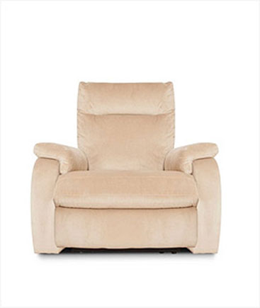
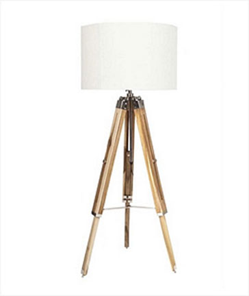
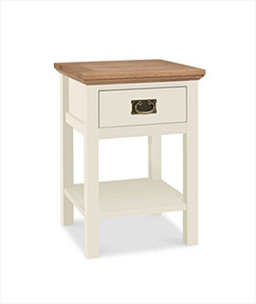
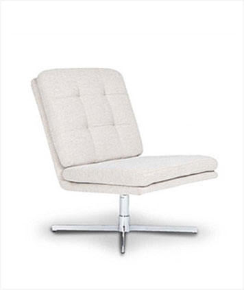
Place a
<img/> tag with class
.card-img-top inside the
div.card tag

Card title
Some quick example text to build on the card title and make up the bulk of the card's content.
Go somewhere
Card title
Some quick example text to build on the card title and make up the bulk of the card's content.
Go somewhere
Card title
Some quick example text to build on the card title and make up the bulk of the card's content.
Go somewhere
Card title
Some quick example text to build on the card title and make up the bulk of the card's content.
Go somewhereCard Body
.card-body
The building block of a card is the
.card-body. Use it whenever you need a padded section within a card.
Special Card title
This is some text within a card body.Titles, text, and links
Card titles are used by adding
.card-title &
.card-subtitle for subtitle of card.
Card title
Card subtitle
Some quick example text to build on the card title and make up the bulk of the card's content.
Card link Another linkCards With Header & Footer
Add an optional header and/or footer within a card.
Special title treatment
With supporting text below as a natural lead-in to additional content.
Go somewhereCards Style
Cards include various options for customizing their backgrounds, borders, and color.
.card-primary info, warning, danger
Primary card
Some quick example text to build on the card title and make up the bulk of the card's content.
Secondary card
Some quick example text to build on the card title and make up the bulk of the card's content.
Success card
Some quick example text to build on the card title and make up the bulk of the card's content.
Danger card
Some quick example text to build on the card title and make up the bulk of the card's content.
Warning card
Some quick example text to build on the card title and make up the bulk of the card's content.
Info card
Some quick example text to build on the card title and make up the bulk of the card's content.
Light card
Some quick example text to build on the card title and make up the bulk of the card's content.
Dark card
Some quick example text to build on the card title and make up the bulk of the card's content.
Cards With Borders
Cards include various options for customizing their backgrounds, borders, and color.
.card .border-primary info, warning, danger
Primary card
Some quick example text to build on the card title and make up the bulk of the card's content.
Secondary card
Some quick example text to build on the card title and make up the bulk of the card's content.
Success card
Some quick example text to build on the card title and make up the bulk of the card's content.
Danger card
Some quick example text to build on the card title and make up the bulk of the card's content.
Warning card
Some quick example text to build on the card title and make up the bulk of the card's content.
Info card
Some quick example text to build on the card title and make up the bulk of the card's content.
Light card
Some quick example text to build on the card title and make up the bulk of the card's content.
Dark card
Some quick example text to build on the card title and make up the bulk of the card's content.
Cards With Accents
Cards include an options for customizing their accent color.
.card .card-accent-primary info, warning, danger
Primary card
Some quick example text to build on the card title and make up the bulk of the card's content.
MoreSecondary card
Some quick example text to build on the card title and make up the bulk of the card's content.
MoreSuccess card
Some quick example text to build on the card title and make up the bulk of the card's content.
MoreDanger card
Some quick example text to build on the card title and make up the bulk of the card's content.
MoreWarning card
Some quick example text to build on the card title and make up the bulk of the card's content.
MoreInfo card
Some quick example text to build on the card title and make up the bulk of the card's content.
MoreLight card
Some quick example text to build on the card title and make up the bulk of the card's content.
MoreDark card
Some quick example text to build on the card title and make up the bulk of the card's content.
MoreCards Header & Footer Style
Cards include an options for customizing their Header & Footer.
.card-header & card.footer .bg-primary . info, warning, danger
Primary card
Some quick example text to build on the card title and make up the bulk of the card's content.
Secondary card
Some quick example text to build on the card title and make up the bulk of the card's content.
Success card
Some quick example text to build on the card title and make up the bulk of the card's content.
Danger card
Some quick example text to build on the card title and make up the bulk of the card's content.
Warning card
Some quick example text to build on the card title and make up the bulk of the card's content.
Info card
Some quick example text to build on the card title and make up the bulk of the card's content.
Light card
Some quick example text to build on the card title and make up the bulk of the card's content.
Dark card
Some quick example text to build on the card title and make up the bulk of the card's content.
Card Groups
Use card groups to render cards as a single, attached element with equal width and height columns.

Card title
This is a wider card with supporting text below as a natural lead-in to additional content. This content is a little bit longer.
Last updated 3 mins ago

Card title
This card has supporting text below as a natural lead-in to additional content.
Last updated 3 mins ago

Card title
This is a wider card with supporting text below as a natural lead-in to additional content. This card has even longer content than the first to show that equal height action.
Last updated 3 mins ago
When using card groups with footers, their content will automatically line up.

Card title
This is a wider card with supporting text below as a natural lead-in to additional content. This content is a little bit longer.

Card title
This card has supporting text below as a natural lead-in to additional content.

Card title
This is a wider card with supporting text below as a natural lead-in to additional content. This card has even longer content than the first to show that equal height action.
Card Descks
Need a set of equal width and height cards that aren’t attached to one another? Use card decks.

Card title
This is a longer card with supporting text below as a natural lead-in to additional content. This content is a little bit longer.
Last updated 3 mins ago

Card title
This card has supporting text below as a natural lead-in to additional content.
Last updated 3 mins ago

Card title
This is a wider card with supporting text below as a natural lead-in to additional content. This card has even longer content than the first to show that equal height action.
Last updated 3 mins ago
Card Columns
Cards can be organized into Masonry-like columns with just CSS by wrapping them in
.card-columns

Card title that wraps to a new line
This is a longer card with supporting text below as a natural lead-in to additional content. This content is a little bit longer.
Lorem ipsum dolor sit amet, consectetur adipiscing elit. Integer posuere erat a ante.

Card title
This card has supporting text below as a natural lead-in to additional content.
Last updated 3 mins ago
Lorem ipsum dolor sit amet, consectetur adipiscing elit. Integer posuere erat.
Card title
This card has supporting text below as a natural lead-in to additional content.
Last updated 3 mins ago

Lorem ipsum dolor sit amet, consectetur adipiscing elit. Integer posuere erat a ante.
Card title
This is a wider card with supporting text below as a natural lead-in to additional content. This card has even longer content than the first to show that equal height action.
Last updated 3 mins ago


